Back in
August last year, veteran and prolific bloggers,
Boak & Bailey (no relation), published a post titled,
“Why are all the pubs
going grey?” It was a valid question, and one which several other commentators
had also noticed. Some, such as
Pub Curmudgeon, Sheffield Hatter, and my good
self, responded with our own thoughts and observations, but the question as to
why so many pub owners (chains, or individuals), had chosen to splash what is
surely the dullest of colours, all over the exteriors of their properties.
B&B thought that maybe pub owners were
“trying to
attract a newer, more aspirational crowd – or at least, not put them off,”
claiming that grey is the equivalent of
“classy neutralness,” whatever that
means.
I don’t follow this argument
though, particularly as I can remember (just), how drab, dreary and undeniably
grimy,
post-war Britain was in the first two decades following the end of the
Second World War.
The pair did recognise this fact, with the claim that even
between the wars, suburban pubs were designed to blend into the local
surroundings, rather than making a statement with garish paintwork and
intrusive advertising signs, but why this recent obsession with what has been
described as a
“plague of grey?”
Pub Curmudgeon described the situation best, with the
comment.
“I really don’t get the rationale behind painting somewhere that is
supposed to be welcoming in cold colours,” and he also mentioned that the
obsession with grey, often extended to pub interiors as well. Whilst I would agree with that observation I have,
particularly over the course of pub visits during the past six months, noticed
a rather different obsessional colour creeping into pub interiors, and one
which, everywhere you look, seems to be rearing its ugly head.
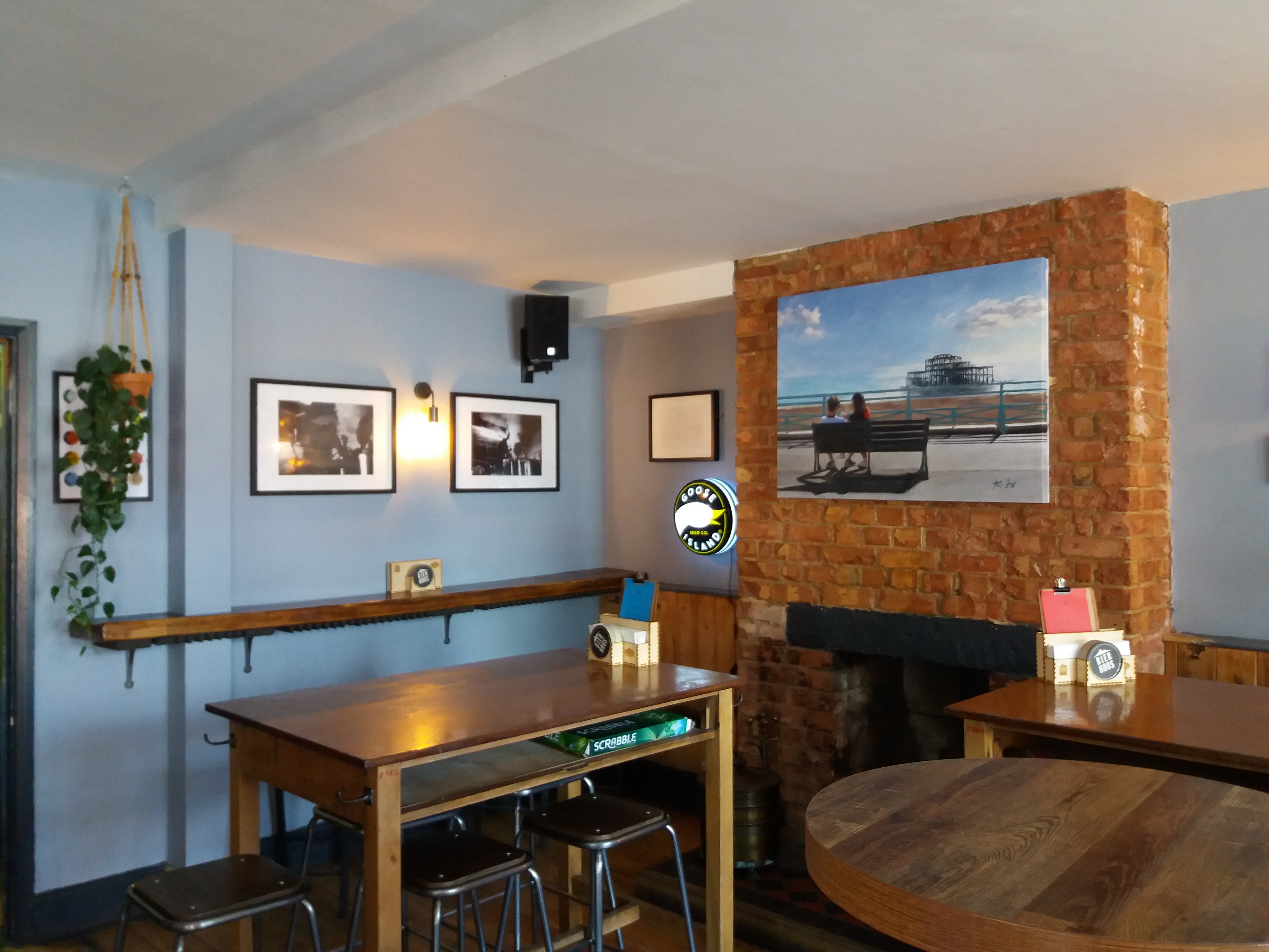
The colour I am talking here is
blue, but rather than a delicate
pastel shade of pale sky blue, or subtle floral blue, I mean full-on, in your
face, intense cobalt or ultramarine blue.
Blue that is designed to make a
statement and demand your attention, rather than a restful sea or forget-me-not
blue, a vivid blue that is not easy of the eye, and the areas of the pub where
these intense shades of blue seem to be splashed the most, are bar counters and
bar fittings.
In his classic book,
Beer & Skittles, pioneering beer
writer
Richard Boston, described the colours of a traditional public bar as a
symphony in brown. He was referring to the wood from which the bar counters, floors,
and often panelled wall coverings, are constructed, and with wood ranging in
colour from pale pine to rich, dark mahogany, it is easy to understand where
Boston
was coming from. Now, with the exception perhaps of the floors, bright vivid
blue seems to dominate, everywhere that one casts ones’ eyes.
I have listed, below, some of the “
blue bars” I have visited since
acquiring my bus pass last year – an asset that has enabled me to reconnect
with many rural pubs that would, otherwise, be impossible to reach without
getting behind the wheel of a car. There aren’t quite as many as I first thought,
but given this is a relatively new trend, there is still plenty of time for
this new
“plague” to spread.
On final point, whilst blue, in the main, is a restful
colour, it is also a cold colour, and like grey, not particularly welcoming.
Also, unless the shade applied is a very pale shade of blue, it is nowhere near
as unobtrusive as grey. So, unless this is just a passing fad, will blue become
the
“new grey," as far as pub interiors are concerned?
Poet - Matfield, Half Moon - Hildenborough, Garland - Redhill, Ivy House - Tonbridge, Vauxhall - Tonbridge, Anchor - Sevenoaks (more of a pastel blue).


1 comment:
Excellent analysis, and totally agree. My observation is that those pubs in pale blue are often the quiet ones.
NB I now know who I nicked "symphony in brown" from ! A great descriptor.
Post a Comment